CAPE FEAR AVE - BEFORE AND AFTER PHOTOS
We all love a great before and after, don’t we? We are excited to show you the fun before and after photos from our last rental home, Cape Fear Ave.
We fell in love with this sweet cottage- it just needed love and attention when we arrived. The dated and broken wrought iron railing, dated scroll detail, and old worn metal awnings. The door was coated in so much old paint (including the window panes). The windows were sad and difficult to use, and the gutters had seen much better days.
Enter a brand new vinyl wrapped porch, beautiful new paint (Sherwin Williams Dutch Door), and a new screen door with all new gutters. We added a cute set of metal window boxes to help dress it up a little bit.
Next we have the entryway/living room. The fireplace was no longer functional or safe and the front door was faced immediately to the back wall of the living room. The room was fairly large, but it was closed off. The classic wood floor was so pretty, but needed a face lift for sure! The light fixture was not a great choice either.
While we were in the design phase, my dad was able to visit to help use check things out!
The kitchen and the living room shared a wall. The kitchen layout was nearly impossible. It was an L shape with the refrigerator in front of the window and cabinets immediately opposite. The other half of the kitchen had an isolated range without much countertop or cabinet working area. Like most of the homes built in the late 1940’s and early 1950’s, the water heater was next to the kitchen sink. Like usual, that had to change!
This kitchen was a very difficult L shape without great placement for much of anything. It was not large enough for an eat-in space, and awkward for any additional countertop placement. The layout was awkward at best and not a space that invited a desire to cook! Also, let’s talk about sheet vinyl - no thanks to this outdated worn piece!
The Kitchen and living room HAD to unite! We knew when we saw this that the wall had to go and we could obtain an awesome living room/kitchen combo, complete with eat in island. We were so excited to see it come to life!
Our fabulous flooring genius, Dustin, was able to tooth in and match the existing 70+ year old flooring with brand new red oak hardwood. Once he refinished it all, you cannot even tell where the old flooring stopped and the new flooring began! AMAZING! Plus, luxury vinyl tile was placed in the laundry room to finish the job!
Special thanks to GEO LIVINGSTON of G&C Contracting who made this vision come to reality - including the custom cabinets! Also special thanks to ARANA STONE for the beautiful arctic snow granite countertops! Also, Darin Halford, you can always be counted on for our open shelving needs and shiplap dreams - where would we be without you? Can we renovate a house without shiplap anymore?
The living room came to life, but the fireplace had to remain boarded up - we had to make that fun and so it became a chalkboard! Also, the beautiful wood paned front door shown in it’s new DUTCH DOOR blue paint from Sherwin Williams. The kitchen and living room shown in Sherwin Williams PURE WHITE eggshell paint complete with Semi-gloss trim in PURE WHITE as well.
There was a little porch that had been converted for laundry (yay!) but it was narrow and unfinished.
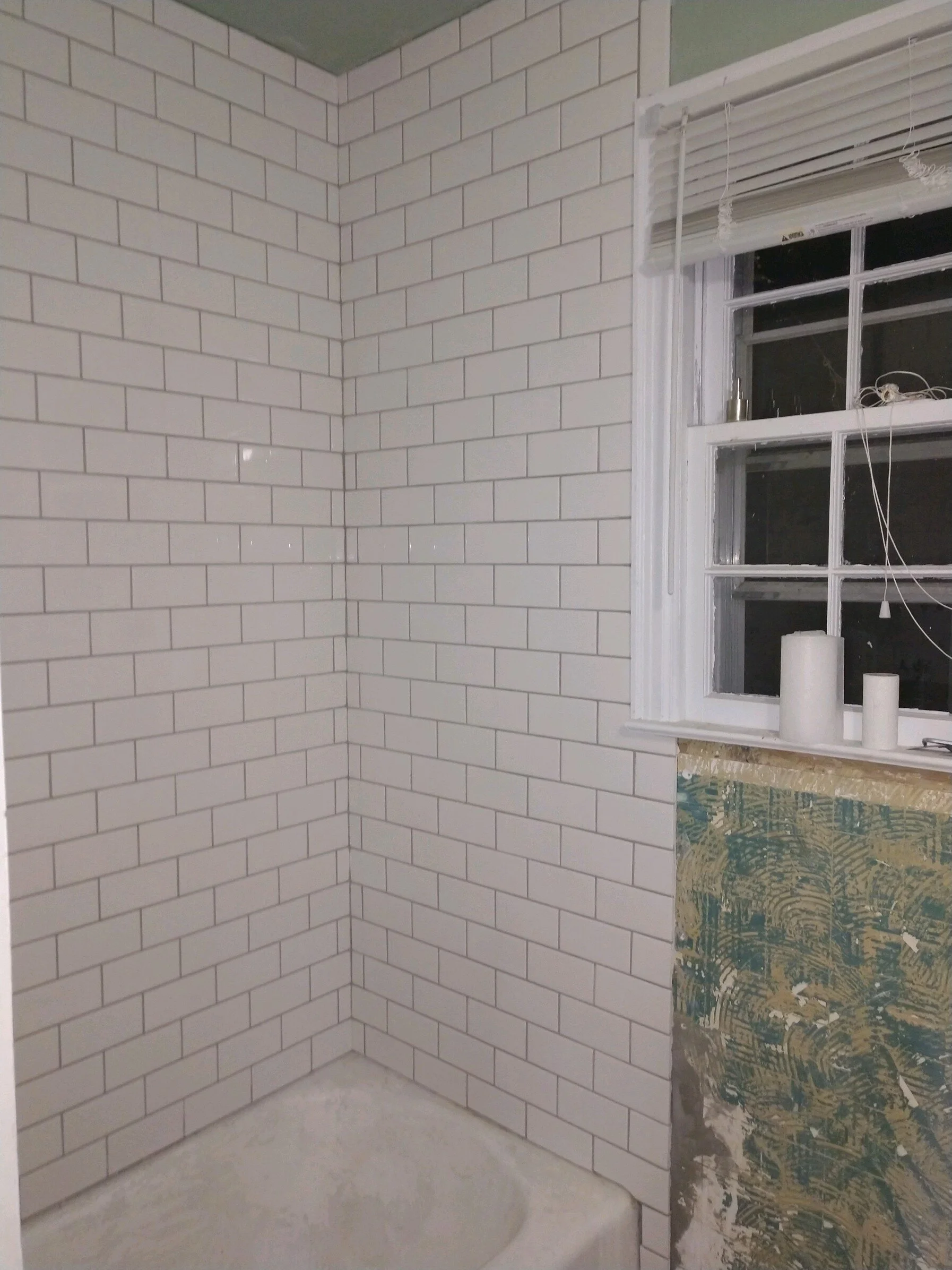
The bathroom had some definite wear and the tile was mis-matched. The tub needed some refinishing and some beautification as well.
Thank goodness for Darin Halford again! His eye for detail was amazing as he redid all the tile in the bathroom and made everything come to life! Frank Layton deserves a shout out too for his amazing tub reglaze! He has saved us every single vintage tub that we have ever inherited!
We love the look of the patterned porcelain tile but hate the price tag! We had used a ceramic patterned version in black and white available at Lowes at our bathroom in our Glenville Ave home, but opted for a softer gray version of the same tile here at Cape Fear Ave. Additionally, we paired with Warm Gray Grout from Mapei.
GIMMIE SOMMORE SHIPLAP!!! Up the walls it went!
Also, we love subway tile. classic. clean. awesome. Darin gets annoyed with us because it is time consuming, but he tolerates us anyway!
The middle room here was not too bad, but lacked definition. Technically a bedroom with its own closet, it was the pathway to the back bedroom so for us this lent itself more to a dining or office space. However, it easily could function as a bedroom!
Cape Fear bedrooms were easy - finally!! They just had their floors refinished, walls and ceilings painted and repaired, new windows and light fixtures. So cute so quick!
We are so obsessed with the floors in Cape Fear Ave - we had long wanted to opt for natural wood refinishing, but most of the floors we had encountered were not in good enough shape to support that vision. We were finally able to do it with Cape Fear Ave.
The bedrooms and dining room in Cape Fear Ave are painted with Sherwin Williams Agreeable Gray, but the color is lightened by 30%. We usually choose to lighten it up to create light and crispness in the rooms. We love this color and it is a staple for us in our projects because it is a warm gray and can read gray or beige depending on the light and the decor within. A perfect marriage of color.
There are so many details the we worked on for Cape Fear Avenue, but the one that we get asked the most about is definitely the statement wall in the kitchen. We had to add some interest to the wall to really make it shine. We debated wrapping the shiplap throughout the wall, but it felt like something more impactful needed to be done…enter this beautiful statement wall! It is simply a stencil and was “fairly easy” to put in! By that , it was imperfect, but fun, a little tricky, but super worth it!
TA DA! We might post a tutorial on how to do this stencil at some point, but for now - enjoy! There are so many styles and types out there and they add such impact for little cost.
We hope you enjoyed the before and after photos - they are always so fun to look back on and see how something was transformed. It was a labor of love for sure!
Thanks for stopping in and have a wonderful weekend. We have another before and after design project coming your way, so keep your eyes open!!
- Casey


