How to Spark Joy in Your Life with DIY Decluttering
Guest post by Virginia Cooper
There are many jobs around your home that require an expert, but if you’re thinking of tidying and decluttering your home, you really do not need an expert to get the job done. All you really need for a cleaner, more organized home are some tips to make the tasks involved easier - and maybe even more fun!
Start by Taking Out and Sorting through Your Things
When you’re ready to begin tidying up your home, it’s helpful to pull everything out. Having everything laid out this way will help you see how much you really have in your home, and will make it easier to decide what needs to go. Take note of items you may have duplicates of or things you no longer need, and put them into their own box. You can toss unneeded items, but it might give you a greater sense of satisfaction if you donate them instead.
Think About Renting a Storage Unit to Make Life Easier
For those items you’re not ready to let go of, consider putting them into a local storage unit. To save time, think about contacting a service to handle this part of the decluttering process. The company sends you a secure storage container to put your things in, and collects it to take to the storage storage unit once you’ve filled it. Plus you will create more space for storage inside your home. You can also use one of these fun garage projects to make better use of that square footage.
Burn Some Calories While You Tidy and Clean Your Home
We’ve talked about ways to make decluttering easier, but if you want to stick to all of your cleaning and organizing tasks, you need to make them fun. As you move around your rooms picking things up and wiping surfaces down, consider dancing while cleaning to make housework double as a fitness routine. If you’re not the dancing type, use these active cleaning tips to get the most out of your tidying and decluttering project.
Redo Your Walls to Open Up Your Space
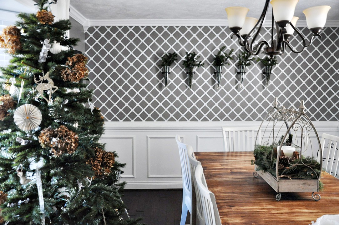
Get the most out of your decluttering efforts by dressing up your home and making it feel less cramped. When painting, avoid dramatic color changes and look for patterns that complement your space. Another idea is to use custom-designed wallpaper for an elegant touch. Repositionable and removable wallpaper allows for simplified application, and it’s available in an assortment of textures and colors.
Give Yourself a Reward for All of that Effort and Hard Work
Getting your home organized will reduce your stress, but you may need more motivation to actually get the job done. To make yourself want to work on cleaning up, make a commitment to treat yourself to something special once all the work is done. Maybe you can go out for a nice dinner at your favorite restaurant, or you can think bigger and treat yourself to a relaxing staycation. You definitely deserve it!
You may not feel a lot of joy while you tidy up your home, but you’ll feel more relaxed afterward. It takes some work to get a home organized, but it definitely does not take an expensive expert. Save that money for something that truly sparks joy for you, and take care of the tidying up all on your own.
When you’ve finished decluttering, reach out to Haymount Homes to help decorate and design your home. Schedule a consultation today!
Photo Credit: Pexels
Haymount Homes REDFIN FEATURE!! “choosing the right art for staging”
How to choose the right art to stage your home for sale. Tips from experts!
Don’t miss the recent Redfin article we were featured in!
Choosing art for staging sounds simple
..but anyone who has sifted through countless options of art and decor, realizes that it can become overwhelming and difficult to select the right art that will help sell your house!
Redfin has taken the guesswork out of it and put together an article to help you understand what you're looking for and how to select the best pieces to stage your home.
We were delighted to be featured in this article and hope you enjoy the tips below!
-Casey and crew
Experts Reveal Their Best Tips on Choosing the Right Art for Home Staging
A well-staged home can make all the difference in enticing a buyer to tour a listing, and something as simple as the artwork you choose can make or break a sale. Your home is where your design personality shines through, but when staging your home for sale, it’s important to keep personal mementos and photos tucked away to appeal to a wide range of buyers.
Everyone will inevitably have differing design opinions, but with a few simple tips and tricks, choosing the right artwork for your home when staging can help buyers envision themselves living there. To help put your home on a buyer’s “must-have” list, we reached out to design experts from Irvine, CA, all the way to Calgary, AB, for their best advice on choosing the right art for home staging.
Select artwork that enhances your home
Let the artwork serve two purposes - choose artwork that adds appeal to the home and markets the geographical region. This makes the home even more appealing to potential buyers. For example, if you are staging a home near a big city, choose artwork that shows images of the city. -Elegant Transitions
Be intentional when selecting artwork to showcase a property. Placement and scale are critical when enhancing the space around the art or using it as a tool to draw the eye to an architectural feature nearby, such as a fireplace. Also, the subject matter of the artwork you choose should be deliberate, such as using a landscape piece to create interest in a dark or windowless room. -Diversa Design
Think of art as an accent piece. Artwork can be used to provide a focal point, highlight a feature in your home, and add color to a space. I have found modern art or landscapes to be the most effective when staging a house - framed family photos and religious art tend to make prospective buyers uncomfortable. Also, be selective about placement. When staging, only a few walls need to be adorned - less is truly more. -Gin Treadwell Home Interiors
Art placement and procurement create a statement within the room by adding focal points, becoming a key role in enhancing the room. Artwork can bring the room to life and serve as an attractive feature to help build up the environment within the room. When you're looking to add character to your room, a few key art pieces may be all you need to bring that “wow” factor that your wall needed. -Eden Home Staging
Be mindful of your artwork choices
Consider the three C's: Color, Contemplation, and Coalescence. First, a pop of color can enliven an otherwise neutral space. Second, art helps buyers envision living in your space by hinting at how a room may be used and evoking certain emotions. Think about the feeling conveyed by a black-and-white cityscape in an office or a blue abstract in a bedroom. Third, art can help unify a space, as may be seen if two or more related pieces are hung on the walls in one or more rooms. For example, use a geometric abstract on a wall in a living room and a similar piece on the wall in the adjacent dining room to create a cohesive look. -Greenhouse
When selecting the artwork, keep your target audience in mind and avoid using art that portrays sinister or risqué scenes, which may not appeal to a broader audience. Instead, choose pieces that can provide a space with a focal point where there isn't one, add color, or emphasize the home's custom features. -CT Exclusive Homes
Envision the finished space when choosing artwork. Know the art story, context, color, size, and location of the wall art when choosing artwork for staging your home. Each piece should have a designated spot in mind (ambiance) to avoid misplaced wall art or proportion (size). -Designs By Dannette
Artwork is the supporting role; the main actor, the central character, is the home. Your artwork choices should mirror a home's style and design - its role is to enhance the vibrant elements and unique features. The masterpiece is always the property; thus, the buyer's eyes should be drawn toward the kitchen, bath, or living space, not a trendy art piece. -Alison Is Real Estate
Freshen up your home with unique pieces
Think outside the canvas. Art doesn’t always involve paint on a canvas. In place of a painting, woven baskets on the wall can add texture above a sofa that features a bright, patterned set of pillows. Mirrors, which provide intriguing reflective surfaces, can also be used in place of art. -Dezign Zoo
Using artworks made from different mediums throughout the home creates an elevated, gallery-like experience. For example, a canvas in one space, a print in another, combined with a sculpture and wall pieces in another room will make the pieces feel less “matchy-matchy” and more like an art collection that a prospective buyer would have. You can also highlight the home's best features and help potential buyers see the home's potential with size and scale. In a room with double-height ceilings, a massive oversized canvas will draw the eye upward and emphasize the height of the walls. -IMG
Be creative and think beyond a typical canvas or framed print. Don’t be afraid to play with textures, shapes, and forms which can add additional interest to the visual appeal a home buyer will relate to. For example, a home with a young family could benefit from brighter colors and whimsical artwork, while a home for a younger couple or single person might be best presented with a more boho vibe, such as a guitar on the wall, a vintage map, or a textural crocheted wall hanging. Mirrors can also be an effective artwork option if the reflection is highlighting an important interior or exterior feature or selling point. -Bloom that Room
Choose complementary artwork pieces
Art is like a topping on the cake, it should go with the design palette to complete the space. Keep your artwork choices neutral, calm, and something that speaks to the room and to the potential buyer. -Jennifer Michele Interiors
Keep it simple. We find that it's best to keep artwork simple - it should be subtle yet attractive to the eye. To present the home in the most appealing light possible, use artwork that doesn’t feature images of people. Instead, consider using pieces that portray interesting but neutral visuals. The best art for home staging will compliment the space it's placed in while not distracting from the home itself. -Beycome
Choose pieces that match your home’s architectural style. A current trend is chalkboard art with inspirational sayings such as “love makes a house a home.” Most important, be certain that artwork won’t be offensive to potential buyers. -Harb & Co
Use artwork that fits the space and doesn't overpower the room. When you start to use big, bold, and personal pieces, you are decorating the space. When determining what kind of art and wall décor to use when staging, you want to be sure to keep things simple and neutral. The whole point of staging is to draw buyer's attention to the features, size, and functions of the rooms and for them to envision themselves living in the space. -Designing Impressions
Use artwork to highlight specific features in your home
Hang art in bathrooms. The use of framed photos of plants, trees, or flowers in bathrooms gives these spaces a spa-like feel and enhances how each room photographs. When coupled with a few white towels and spa counter accessories, art can transform even the most outdated bathroom spaces. -Knoxville Staging Services
Art is the bow on the 'package' in room décor. It should be the first thing to catch your eye and draw you in to see what's inside. Abstract pieces that feature strokes of color on light canvases are always a good choice, especially if the frame is in a metallic finish that complements the light fixtures in a room. They catch the eye and draw people in, but they don't outshine the room itself, which is, after all, what good staging is all about. -Staging That Sells
Keep scale in mind when choosing artwork for staging
Choose large canvas wall art in the colors and style of the house. Wall art on each wall can make your home appear cluttered. Instead, large canvas pieces are easy to hang and will draw the eye to the home's focal points. If you have a large gorgeous fireplace, a large bright piece of canvas art will highlight this feature. Only hang wall art in spaces that are focal points for the listing photos to direct a buyer's eye. If you have one or two smaller plaques or pieces of wall art in a large area, it will look out of proportion, so make sure it's all in scale to the size of the room, the ceiling height, and the size of the furniture. -Dramatix Decor
Choose artwork that is “show-worthy” and offers the drama necessary to create a cohesive space. Keep in mind that the larger the scale, the fewer pieces are needed (and fewer holes in your walls when staging). Your artwork choices are also the foundation for selecting the accent colors to use in a home. Colors should flow gracefully from one space to the next. -Impact Home Staging
If you have a large empty wall, search for large artwork to anchor the space. You can then tie in the colors of the décor in the room to the artwork's colors, exhibiting a very uniform look. -2 West Photography
Along with selecting neutral art, be sure it's scaled and hung appropriately. We often come across artwork placed on walls in the wrong orientation, size, and or dimension. The center of the artwork should be 57 inches from the floor, 6-8 inches above a piece of furniture, and 3-6 inches apart when in a grouping. -Simplicity
Make sure your artwork choices are balanced
Think about how multiple art pieces are going to look when showing various rooms in a single photo. For example, consider how strategically placing a painting on the wall of one room, like a bedroom down a hall, might give depth to the living room in the foreground. Instead of showing a blank wall, that extra splash of color on the far wall could help to extend the perceived size of a space and make it more attractive to potential buyers. -The Best Local Real Estate Photographers
Choose art that is large and balancing for your space so that it’s eye-catching and attention-grabbing in photos. More often than not, a large statement piece of art will look more dramatic and enticing than multiple smaller pieces. Buyers love interesting photos with clean lines, and large statement art will help draw them in. -Haymount Homes
Artwork should be appropriately sized for the location. Wall art should take up 65% of the available wall space and be about 2/3 to 3/4 the width of the furniture. Your artwork choices should also have an impersonal, but coordinated, theme throughout the space. For example, sticking with abstracts in contemporary spaces, nature scenes in traditional spaces, and water or beach scenes in bathrooms. -Her Home Design
Originally published by Redfin
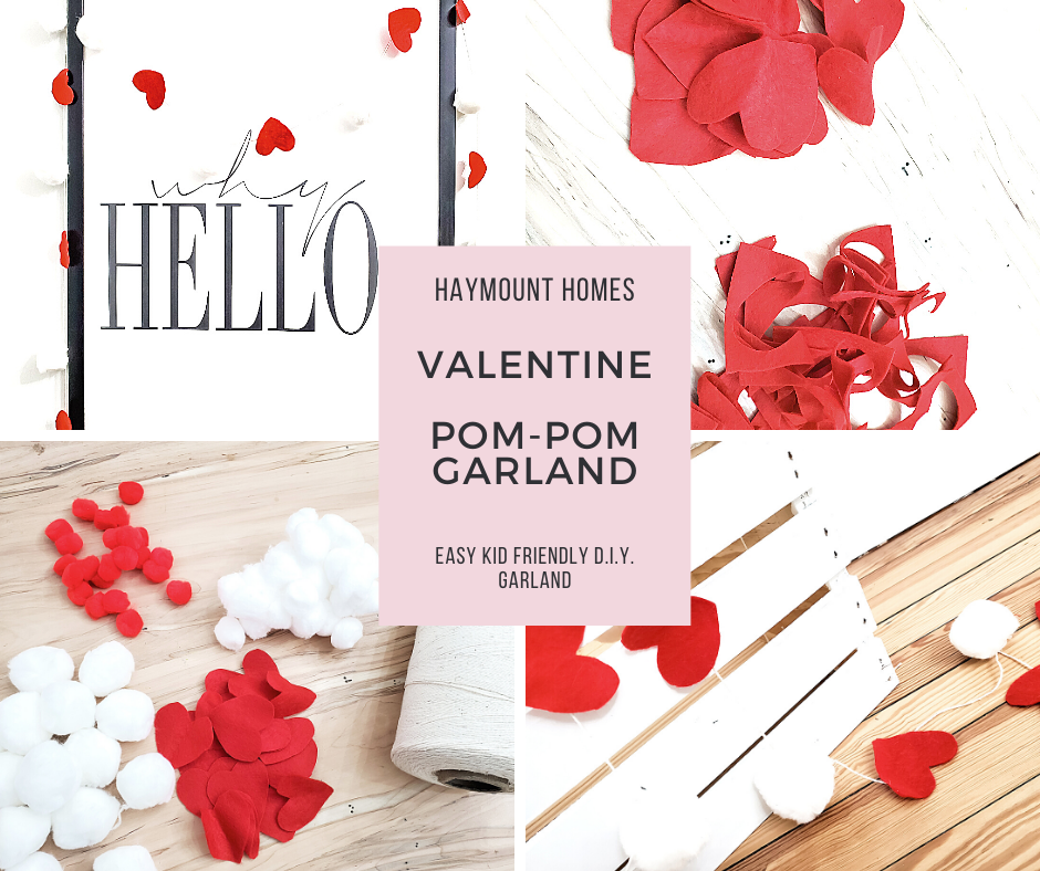
VALENTINE'S DAY - D.I.Y. FELT HEART POM POM GARLAND TUTORIAL
An easy Valentine’s Day Felt Heart and Pom Pom Garland Tutorial - Kid Friendly!
Happy Valentine’s Day!
We hope you are enjoying your sweethearts and filling you day with love. We wanted to share a quick and fun, kid friendly tutorial that we created for some fun Valentine’s Day decor this year: Our Felt Heart Pom-Pom Garland.
This tutorial is easy, can be imperfect, and fun. The only piece of caution is don’t get it tangled like we did when you finish - what was quick and easy became long and frustrating once tangled.
You’ll need:
Felt (color for your hearts)
Pom-Poms (if you don’t have them, use cotton balls!)
String
Hot Glue Gun/Scissors
Step 1: Create your Heart Template - cut out some hearts but folding over the felt and creating a template heart that you like. Repeat this step for each heart, using your template heart as a pattern guide. Enlist some help like I did - tousled hair and straight out of bed but it worked. Don’t worry if your hearts have jagged edges or all are not quite uniform….it sorta adds to the charm. We would argue that all hearts have been shaped in their own ways……
Step 2: Cut your string and start to add the hearts and pom poms, alternating their attachments on the string.
Step 3: Let them dry. Hang your garland and enjoy! If you find your hearts flipping, we just added a little tape to the back to keep them in place where we hung them.
Enjoy this fun garland - it is bright and happy and the perfect way to create more LOVE this Valentine’s Day! Feel free to substitute more colors of pom poms - we never did use the red ones we bought as they did not really coordinate with our felt, but you can change this up so many ways. Post a picture of your creations if you feel like it - share the love!
-Casey and Crew
Haymount Homes REDFIN FEATURE!! “Selling Your Home in the Winter? Here’s How to Stage it While Embracing the Holidays” (Copy)
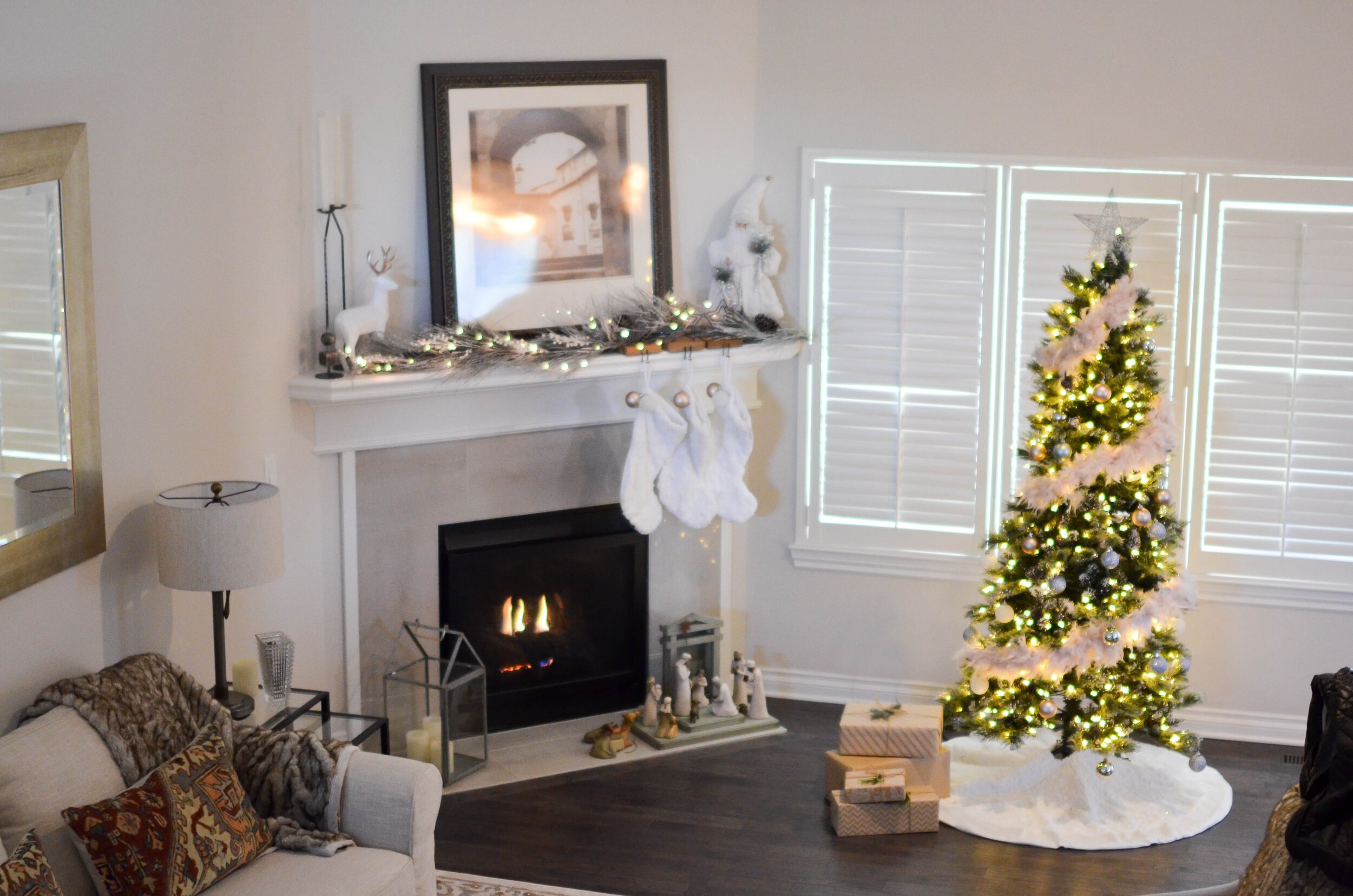
Don’t miss the recent Redfin article we were featured in: “Selling Your Home in the Winter? Here’s How to Stage it While Embracing the Holidays”
While many believe the ideal time to list your home for sale is in the summer, the truth is that selling your
home in the winter can be just as great. But like any other time of the year, it is in your best interest to
present your home in its best light. This is where beautiful staging and professional real estate
photography plays an important role.
To help you highlight your home’s best features this holiday season, Redfin reached out to staging experts and professional real estate photographers for our advice. To make sure your home stands out in the housing market while still embracing the holidays, check out what we had to say in the article:
https://www.redfin.com/blog/selling-your-home-in-the-winter-staging-advice/
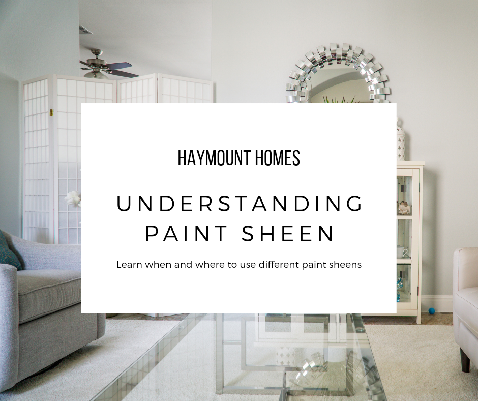
UNDERSTANDING PAINT SHEEN
Understanding the different sheens of paint - and where and when to use them!
Happy Spring! There is something about spring weather that inspires change. I think it is the season turning over and the new life of spring replacing the dreariness of winter. Don’t get me wrong - I love the coziness of the winter season, but there is a turning point where I am ready to move beyond the dark nights and into the fresh air and sunshine of spring.
Spring brings the energy of change…and with it comes spring fever. For me, that means cleaning house. The funny part is, once my house cleaning train begins, suddenly I am inspired to do more. I see a transformation of decluttering and a space seems new all over again. So, I start thinking about refreshing the space, which usually leads me to my most economical and high impact solution - paint. It’s kind of like the “if you give a mouse a cookie” book. If you give me an hour and a trash bag, I will eventually want to paint a room :) It’s a small disease I have; unfortunately, it’s a chronic illness!
Paint means a lot of things - you find that out the minute you step foot in a paint store. Once you have chosen your paint color, the next question is going to be about what paint sheen you will choose.
There are lot of reasons to choose certain sheens, but I wanted to provide a quick overview on what benefits each each provides, how it is most often used, and when to use each type. Hopefully that will be helpful to anyone out there that is having this question themselves.
Most often, paint can be found in the following sheens:
Flat
Eggshell
Satin
Semi-gloss
Gloss
This can get more complicated by each brand. For example, Sherwin Williams adds additional names to their sheens like Low-Lustre, Pearl, flat Enamel and Matte. Understanding the type of sheen you need will allow you to enter any paint store and ask for the sheen you want and they can provide you with their brand’s equivalent. While there are variations on each type of sheen, this should give you a basic overview. Let’s begin!
FLAT
Flat paint is your most inexpensive paint. It is the most basic of the bunch and is the most economical. For this reason, flat paint is often used in new construction. It costs less, covers easily and is easy to use. Flat paint also tends to hide imperfections and flaws in surfaces. Flat paint is often popular in older homes because walls are imperfect and the paint does not have a reflective quality that highlights flaws.
The drawbacks to flat paint is mostly durability and sheen. It is exactly what it says it is - flat. There is no luster or warmth to the paint, and there is also very little durability. In fact, you can scrub the paint right off the walls if you use water and a rag (or we found out with Mr. Clean magic erasers!). Thus, if you have a low traffic area with some imperfect walls and are on a tight budget, flat paint will likely get your job done. As for me, I almost never use flat paint. If I am going to spend the time and money painting, I am going to do something that will be more durable and warm.
The only place I do consistently use flat paint is on the ceiling. It is almost never touched and I don’t usually need the reflective quality of the paint there. There are times i have made exceptions to this, but typically, you can do flat paint there with little difficulty.
EGGSHELL
Your next step up in paint is Eggshell. Eggshell is like flat paint with a hint of sheen. Eggshell paint has about 10-25"% sheen in it, depending on the brand. The sheen adds a touch of warmth and durability, without being super glossy. It can handle a bit more scrubbing and traffic, but is still not considered a high durability paint. Because it is not super glossy, it still hides imperfections fairly well.
If your budget allows, I would make this your basic minimum paint level for most walls in your home. If you have a high traffic area, then I would upgrade to satin and here’s why….
SATIN
Satin paints are usually about 25-35% sheen. That is a great combination of durability and warmth, without being high reflective and shiny. A satin finish allows a great level of durability (think good solid scrub on the wall), and will not fade as easily. Satin finishes will show imperfections a bit more, but they offer forgiveness for marks and spots which can be removed.
If you have higher traffic areas, pets, or kids (or maybe you are just rough on your living space!), then satin paint is a great happy medium. It does cost more than its little sister Eggshell, but usually lasts longer, can be cleaned, and offers great warmth to a space.
If you are painting a kitchen or a bathroom, this should be your minimum level of sheen. You can also incorporate some anti-bacterial paints into satin for these areas, that is often a good idea since these types of room seen a higher level of moisture.
SEMI-GLOSS
Anytime you see gloss in the title, we have moved into “shine” zone. Gloss paints have more gloss in them. Like in our other paints, more gloss means more durability, but also higher sheen. Now you are going to see more flaws in whatever surface is covered in semi-gloss paint because the gloss will reflect the imperfection when light hits it.
Though it does highlight imperfections, the trade-off is great durability. I like to use semi-gloss paint on cabinets, trim and baseboards because they see heavier wear.
Semi-gloss paint can come in a variety of sheen percentages - anywhere from 35-70%. The higher the sheen, the more durable and shiny the surface will be. There is a recent trend to paint semi-gloss on walls, but for me, it is too reflective.
GLOSS
Gloss paint is glossy (shocking, right?). When you open a can of gloss paint, you’ll know it. Even in the can, gloss paint is thick and shiny; it’s actually quite beautiful. Gloss paint is my favorite for a front door - bright, shiny, and thick. High gloss paint is durable and can be scrubbed and scrubbed. It is also the most expensive since you are paying for that gloss. Some people really believe in high gloss for all cabinets and trim, but I prefer a slightly more matte look. High gloss will highlight any type of surface flaw, so remember that when applying. It is also a little more difficult to paint with as it is very thick.
OTHER CONSIDERATIONS
Room Position
Natural light and also the size of the room can help you decide on your paint sheen. Rooms that are filled with natural light will tend to throw more sheen and color throughout the room. You can safely choose a lower sheen paint (like eggshell) and probably have the same level of warmth as a satin painted room. The inverse is true as well. Poorly lit rooms often benefit from a higher sheen. What little light there is in the room, can more heavily bounce off the sheen and warm up the space.
Wall Texture
Walls that are textured or imperfect will look better in a flatter sheen; it will help smooth them out. Just remember your trade off for the sheen is lack of durability.
Moisture Level
Rooms suspect to higher moisture often benefit from a higher sheen paint as it is more durable and less suspect to moisture retention. The sheen can help reflect moisture.
Room Size
Higher sheen paints allow light to bounce and help make rooms feel larger. It sounds crazy, but can really help ‘open up’ a room visually.
Same Tone, Different Sheen
One of the most popular trends right now is painting the trim and the walls the same color. This look is seamless and really can open up a room, giving a larger visual appearance. The best way to achieve this look is to paint the walls in a lower sheen paint, and then paint the trim in a higher sheen. You want a nice level of contrast here.
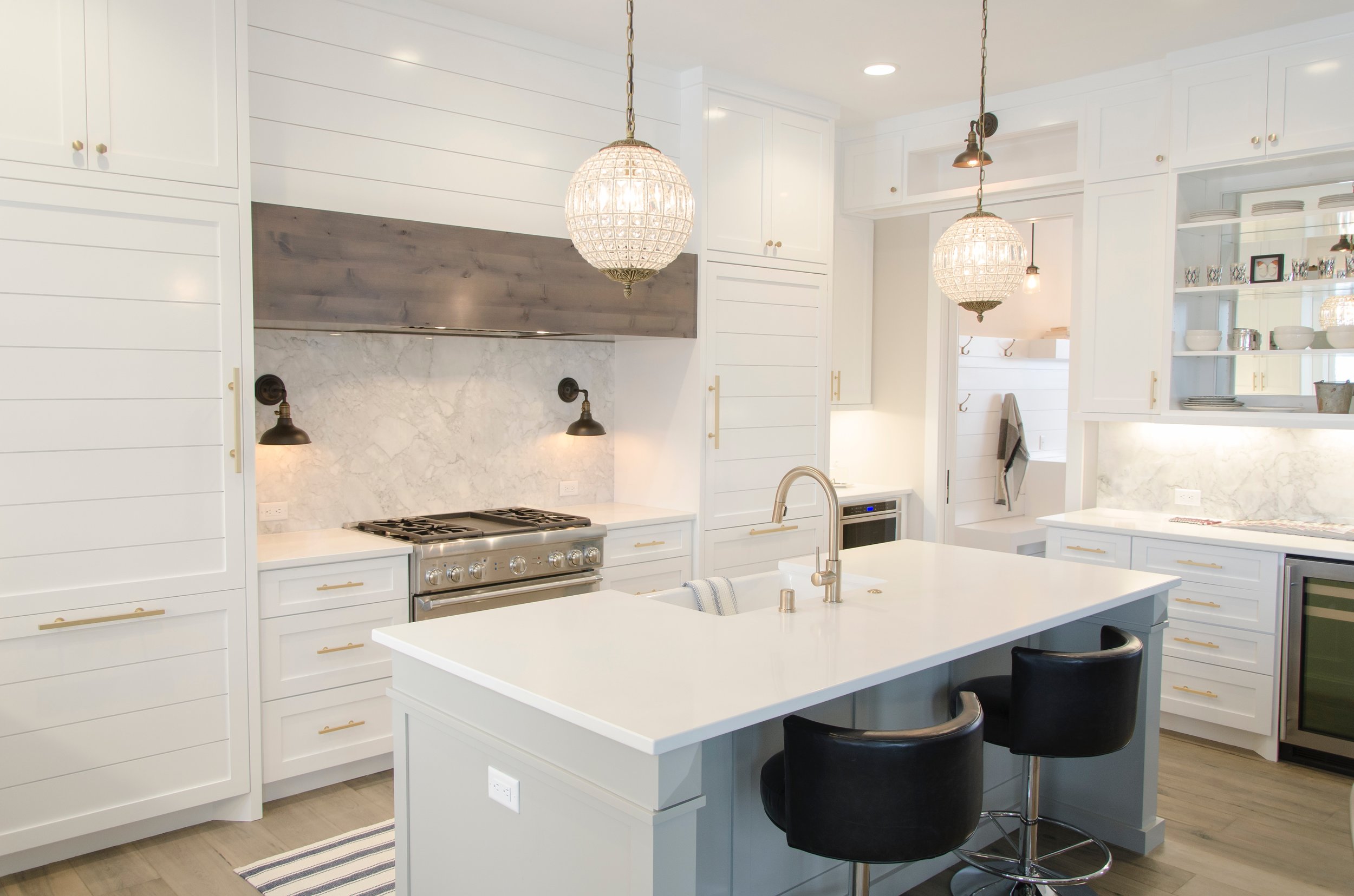
Depending on your taste, you might consider an eggshell wall with a semi-gloss trim. If you don’t mind spending a bit more and having a bit more light bounce in the room, then going to a satin finish wall and high gloss trim can work as well. The result is really stunning! The picture above this section with the fireplace illustrates this technique.
“All you need to paint is a few tools, a little instruction, and a vision in your mind.”
I hope that this helps you determine what type of paint sheen is best for your space. Remember to consider cost, lighting, room size, and surface texture when choosing your sheen. Again, my catch-all favorite is satin for walls and semi-gloss for trim, but you should feel free to experiment and find out what appeals to you!
Happy painting!!
-Casey
Restoring Worn and Faded Leather
How to restore faded and worn leather using recoloring balm
Hey y’all! Can you believe it is December? It seems that time flies faster each year. Last night we had a Christmas potluck and it was wonderful to see so many friends. One of the topics that came up was about our two leather chairs (that currently have no actual home) so I snuck them into the dining room. Like most things that have snuck their way into our home, these two chairs had a story behind them. Also, you have to promise to excuse my unswept floors in all my photos. Alas, it’s true….my floors get dirty and I often don’t feel like dealing with it (especially during a project).
I am a craigslist junkie. There. I said it. I love to look for furniture and other household things that someone is no longer needing and see if we can give it a new life. Just like fixing up our homes, I love to fix up something that has been worn and forgotten; it gives it a new lease on life! Not only does it keep landfills from filling, it gives me a fun project with the kids and it is a great creative outlet. The sense of pride from fixing something is really fun!
That stated, Carl is convinced I am going to die someday by meeting someone on Craigslist. Thus, I have to control my habit to the extent that I know he is going to have to get involved to participate in the exchange. This is NOT his favorite thing to do (I know, right? He just doesn’t quite understand the thrill like I do :) Therefore, I have to be picky about what I have him do.
My two leather chair babies were born onto craigslist a few months back. They were out on a horse ranch in Southern Pines (which is a good hour from us) near Pinehurst. In the photos they looked amazing and I thought they would be perfect for staging our next home. They were priced at $300 for the set. Although they were not a “cheap” craiglist buy, they looked like they were well made and actually real leather, so knew they should be worth the gamble. I tried to pretend I did not want them, but I am a poor actress in that respect. Carl sensed he was about to get roped in and offered to go get them (yes, he is awesome).
Now, the only real issue with Carl going to get something I want on craigslist, is that he doesn’t quite share the shame discerning eye that I have. Therefore, you can imagine my surprise when my two leather chair babies showed up at our house…..completely faded and PINK (like 1980s mauve pink!!!). !'?#& was the word shouting in my head the moment they arrived. Of course, Carl, who had just driven three hours to get them for me, was less than thrilled that I was less than thrilled (that is the lot of a husband, right?). He even offered to take them all the way back for me, but I could not bring myself to do that. My sunk cost of time and money was too high to just scrap all of it. $300 is not crazy high, but it was high enough that I could not just give them away.
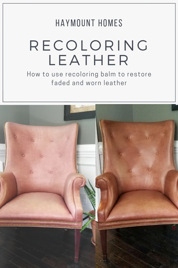
So I had two pinkish faded leather chairs on my hands. What to do???? I could tell they were very well made, so I new that they were likely worth keeping if I could figure out how to salvage them. I considered my options
Just leave them alone. Terrified me. I did not want pink faded chairs. That was out
Recover them. Holy pricey.
Paint them. Seemed like a horrible waste of leather.
Hire someone to fix them. I had no idea who did that or what to even look for.
Stain them. This was the only thing I could figure out to do….so I went with it.
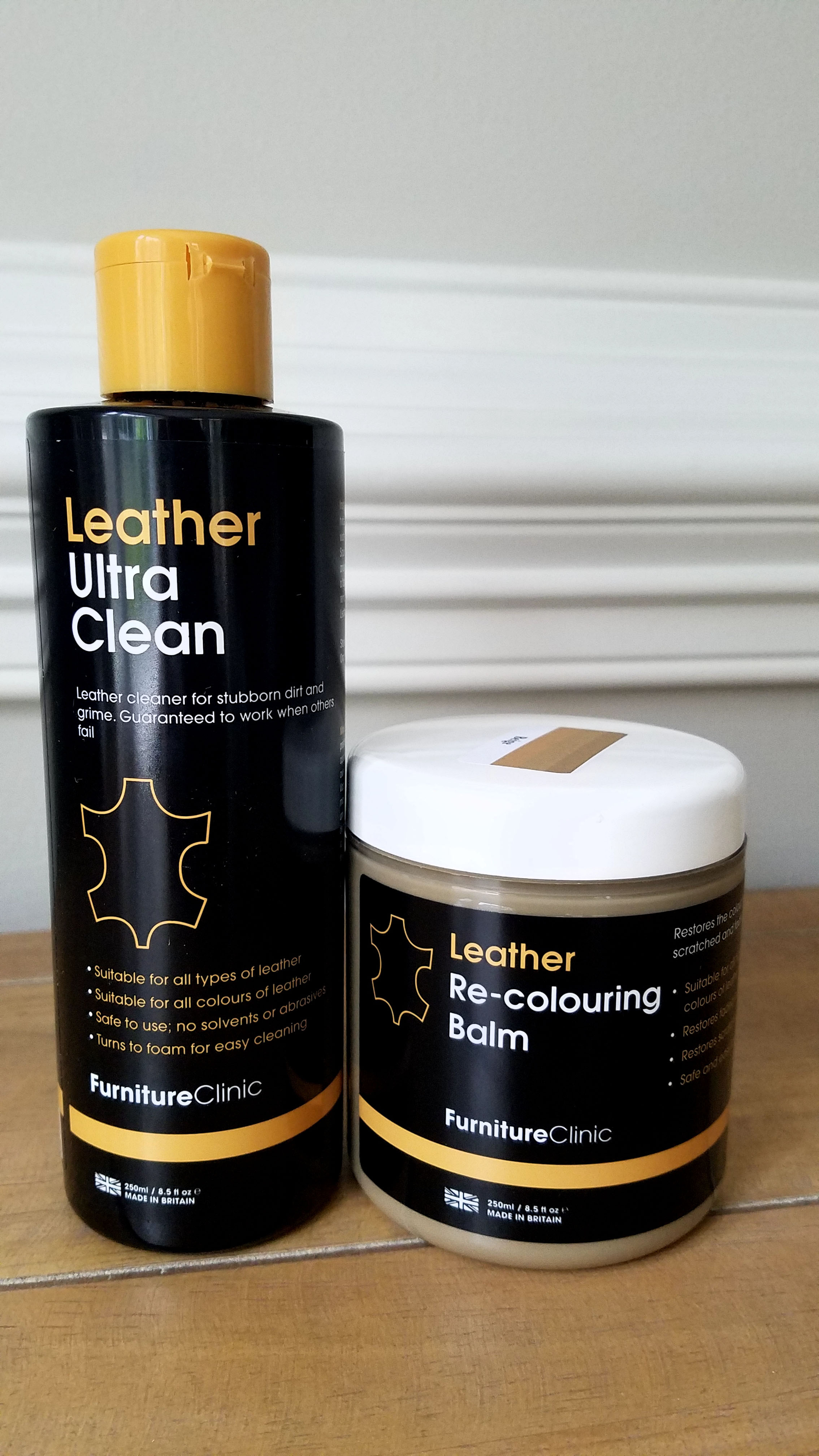
Staining leather? Yes. I figured leather was stained by manufacturers to gain its original color, so it must be the best thing I could do. I actually even considered using minwax wood stain or shoe polish, but then I stumbled across this:
I was intrigued. I figured it was a gamble worth taking. You use this balm to gradually stain back the leather colorization to the material. I did not really know what color the chairs were supposed to be, so I took a gamble on the camel color…..which ended up being wrong. Fortunately, this amazing company allowed me to order a second color free of charge. This time I nailed it with Medium Brown.
The interesting thing about the balm is that you can apply it in layers and it gradually richens in color. That was handy since some of the parts of the chair were more faded than others. It was simple to use. I also started with the leather cleaner to make sure that the leather would absorb the color properly.
Here were the steps. Pretty simple:
Test the leather for absorptive qualities (water drop on the chair and see if the leather pulls the water in. If you have a protective coating on the leather, then the balm cannot absorb)
Clean the leather and allow it to dry (took about 20 minutes)
Start rubbing in the balm. Think about polishing something. If you have ever applied a wax to furniture, it is a similar process.
Allow to dry and then repeat coats (it dries fast)
Clean the leather
Apply stain
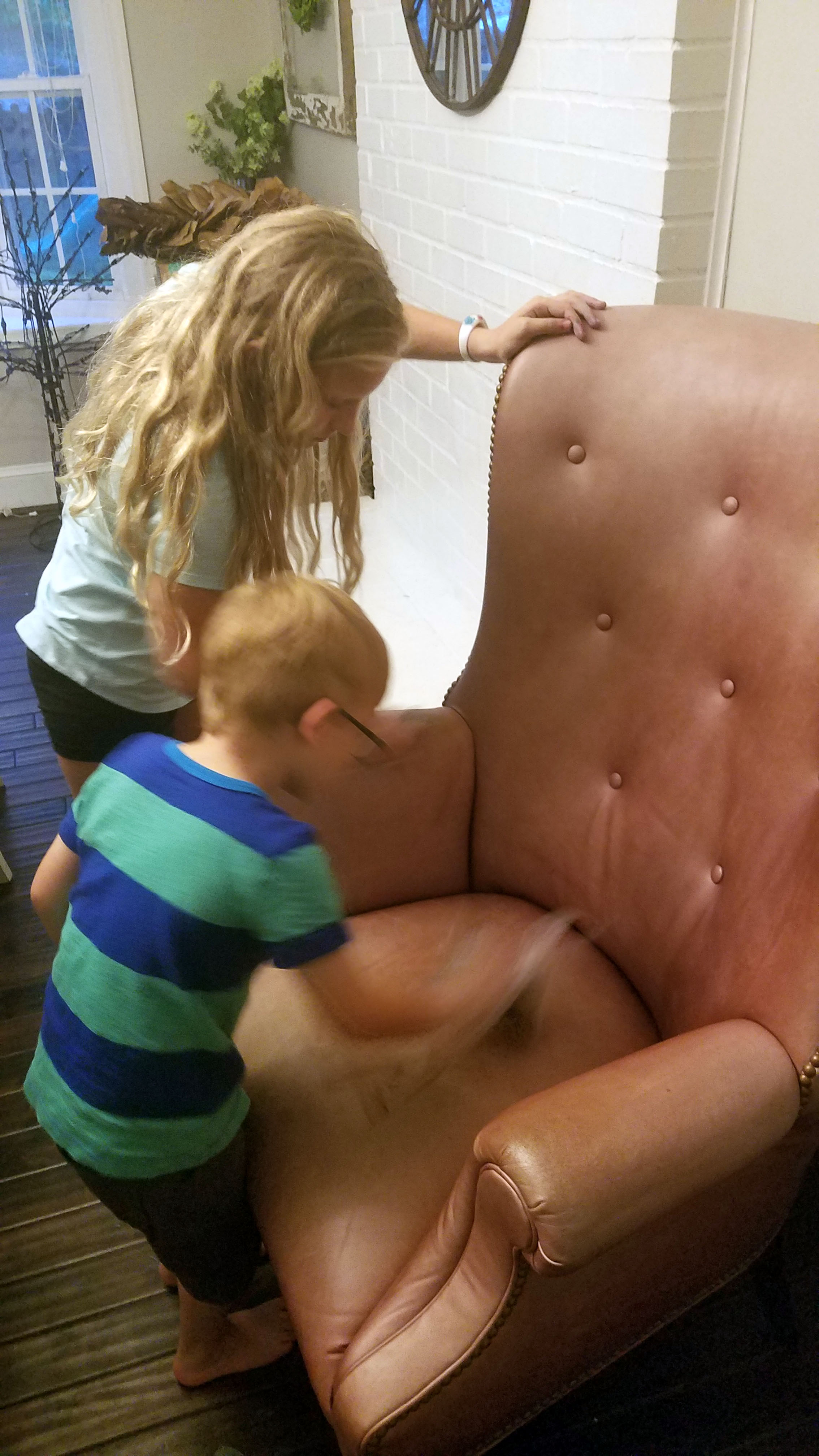
Recruites! Even kids could do it
See the difference after a coat or two?
So my next fear was colorfastness. I just figured that the stain would transfer to clothing (and subsequently that I would have unhappy friends!). I let it dry for 24 hours and then I tested the chair by wiggling everywhere on it in a crisp white shirt (gutsy, right??) Guess what? NOT A MARK on my shirt! I could not believe it.
Now, let’s talk cons. This is not perfect. There are some areas that are a bit streaky and imperfect, but leather does sort of lend itself to imperfections. Also, when you consider the fact that the chairs would have been well over $1000 each to recover, I think I can handle my $40 dollar fix.
Are you ready for the fun part? I found out that the chairs were made in Hickory, NC. For those of you that are unfamiliar with that, High Point/Hickory NC and the surrounding area is one of the most high end furniture markets in the world. They manufacture some of the best made furniture you can find. I managed to find out that each of these chairs can still be ordered from Hickory…..to the tune of nearly $3000 per chair! My all in cost on these chairs was $340. I will take that.
I was now hooked. I started to think about shoes and purses in my closet and when I get around to it, I will likely stain those as well. The balm refreshes the leather and brings it back shining!
Also, for note, this tutorial is just from me. I was not paid or given anything by Furniture Clinic. When I was looking at the product, I was hoping that there would be an in depth review or blog post that had used it, but I could not find one. I figured I would post one to help out the next panicked craiglister!! This post does contain affiliate links to the products so you can find them and try them on your next project!
Are you going to try it? I think you should! It was fun and easy, and it really worked pretty well. That is NOT good news for Carl; it opens up waaaaaay too many more options on Criagslist!
We’ll talk soon!
- Casey
CHOOSING PAINT COLORS - PART THREE - EVALUATING THE LIGHTING
Understand how lighting affects paint colors so you don't end up suprised
Welcome back to my evaluation of paint color series. The purpose of this series is to help evaluate paint colors BEFORE they hit the wall. We have all been on the opposite side of that scenario. We have chosen a color that we just "knew" was perfect for our space, only to waste $100 in paint and 15 hours of our time painting the room that color and end up being disappointed. Whether the shade was not quite right, or the color ended up totally different once it hit the wall, it is never fun to waste your time and money on projects that leave you discouraged.
Learning how to properly evaluate your colors can help you avoid this scenario. I cannot promise that the above story will never happen to you again, but hopefully you'll see a decrease in your painting regrets!
In the first part, we learned to evaluate the undertone of a paint. When you do this, you can better understand the type of shade that will pull through when the paint hits the wall. If you missed that post, you can catch up here.
In the second lesson, we covered evaluating your layout when choosing paint colors. Realizing that rooms are viewed together and often in the same visual lens helps you choose colors that coordinate and lend themselves to a pleasing "whole house" palate. To catch up on that lesson, simply click here.
Now in the third part of the series, we are going to cover how lighting affects color. Once you have determined your undertones and looked at your layout, you need to understand lighting and what it does to color. The most important aspect of lighting is determining what direction your home and rooms are facing. What I mean by that is knowing the position of your home on your land/lot, and then from there establishing where north, south, east, and west are. Once you know the directional position, you can determine what direction each room is situated within your home.
The purpose of determining the position of each room is that lighting is directly related to room position. The conditions of lighting in a north facing room, are quite different than the lighting that is received by a south facing room. The same goes for an east or west facing room. Therefore, colors that are painted in a north facing room might look entirely different when it is painted in south facing room. This is one reason that you can decide to paint a room "gray" and it ends up looking "blue". You can paint a room "white", and it ends up looking
"yellow". When the undertone combines with the natural light, it can enhance certain parts of the paint and bring through those undertones more strongly than you had anticipated.
COLOR ANATOMY
One more note on this before we get started. It is helpful to understand how we actually "see" color. Your eyes and your brain work as a team to actually create the colors you see. You have light receptors within your eyes that actually "grab" wavelengths and then transmit them to your brain. Objects (walls, furniture, anything!) actually all absorb or reflect these wavelengths. When an object reflects all wavelengths, then the color is white. When an object absorbs all wavelengths, then the object is black. When an object does a combination of absorption and refraction, we see color. We only see what is refracted, not what is absorbed.
Thus, no object or wall actually has color. Rather, it only has refracted light that is thrown back out and not absorbed. We only see the color thrown back (refracted wavelength of color), and then our brain processes that color to identify it. When you look at a basketball, you see orange because orange is refracted and the other colors are absorbed. You have to have light to have this refraction occur. Entering a dark room is a perfect example of this. When you enter a room without light, the room appears dark. Even though there are some brightly colored or light things in the room, they are not seen as light because there is minimal light being refracted. If the sun comes up or the lights are turned on, now our eyes receive the refracted wavelengths and our brains can process them as color.
Therefore, it is necessary for light to "bounce" in a room and refract the wavelengths of that color within the room for us to see the color that is there. When you are deciding to paint a wall, it is important to consider how much light is going to be there. Paler colors have less absorbed color and are more dependent on refraction for their purest form. Additionally, because the color is still subject to our brain processing the information, one person might see a certain shade of a color and someone else might have a slightly different opinion of the same color. Neither person is wrong, but they truly might be seeing different levels of refraction and processing them differently.
Have I confused you yet? It doesn't need to be that hard, but you need to understand how light and color work so you can utilize that in your paint selection. Hang in there.
One more thing. When we discuss lighting from this point forward, we are discussing the natural light that a room receives from the sun. Obviously, you can add artificial lighting to spaces, but that will change the tone of the room depending on the shade of lighting you choose. You need to start with the room's basic position and natural light and then move from there with paint color selection. Artificial lighting can be added later to further enhance the room's tone and feel (I will add a note to this at the end).
Let's unpack this a little bit and start with some basic ground rules for each type of room.
NORTH FACING ROOMS
North facing rooms tend to be darker, receive less natural light, and therefore tend to not "throw" the light around the room as much. This lack of light naturally means that the room will bring out cooler, less warm undertones because there is less refraction of light.
If you have a darker color in mind, they tend to do pretty well in a north facing room because the paint itself provides a lot of tone and it doesn't require as much light to "find" the color. These rooms tend to be cozy by nature and play well to enhancing that feeling with darker colors.
If you really want to paint a north facing room a lighter color (which I have been brave enough to do), then you want to remember that cooler rooms are going to bring out cooler undertones. That means if you choose a white color with a gray undertone, it is going to look much more gray and cool than it will white. If you choose a white color with a yellow or pink undertone, it will bring more warmth to the space and the color will bounce a bit more.
The room above is a north facing room and is shown painted with in Farrow and Ball's Cornforth White. This color is a favorite or mine because it is neither too warm or too cool. In a room with either warm or cool lighting, this color will still shine beautifully. It is still a light color, but has enough color pigment to pull through and refract even in a darker room.
SOUTH FACING ROOMS
South facing rooms are the darlings of decorators. They receive light throughout most of the day and have plenty of sun to bounce around the room. That means you can get away with nearly any shade in a south facing room, although if you want to paint something a lighter color, this is the room to maximize that effect.
A south facing room will still bring out undertones, so be sure to consider that with your choice. A yellow or pink undertone will read creamy and warm in a sun filled south facing room. For example, one of the decorating world's most popular white colors is Benjamin Moore's White Dove. My daughter recently painted her room this lovely, creamy white color. It reads slightly yellow due to the bright southern light that the room receives. If you select a white that has a cooler undertone, the white can read more contemporary in the space. Depending on your goal, you can select things to warm things up or cool things down.
If you have a south facing room, enjoy it. It will be a home run with a pale color and it will still live up to a dark color too. In the south facing room shown above, the color is Farrow and Ball's Skimming Stone. It has warmer grey undertones and the light just dances around in the room, making it bright and cozy.
EAST FACING ROOMS
The sun rises in the east and sets in the west. Therefore, east facing rooms will experience more sun in the morning and less sun as the day progresses. Therefore, consider the function of the room and what time of day the room will be utilized the most to help you determine what color you want to see at that time. If you are looking to retreat to the room toward the end of the day, then plan for the darker lighting that will be there at that time. If the room is a bedroom and you want to greet the day in a lighter environment, then look to capitalize on the early sun and go with a lighter color that will be brighter in the morning.
As as undertones run, east facing rooms are often felt to provide a cooler undertone, so choosing colors that have cooler undertones will likely enhance the color of the room. For example, if you paint an east facing room with a yellow undertone beige, it is likely to turn out a bit different than it looks on the paint chip. If you chose a similar beige with a green undertone, which is a cooler color, then you will likely see a color that shines truer when it hits the wall. That is not to say you cannot choose a warm undertone for the color in an east facing room, but understand that it will likely have more shift on the wall from what you might expect.
As mentioned, the time of day will matter too. In the morning, east facing rooms will have more warmth due to sunlight, and they will fade to cooler as the day progresses. Keep this in mind when choosing color samples.
The office room shown above is an east facing room. It is painted in Farrow and Ball's Strong White. This color is a cooler gray white, which was just beautiful in this room. In the morning, the walls look nearly white with a cool gray undertone. As the day progresses, the gray gradually deepens and starts to peek through. I was initially thinking that I would paint this room a more pure white, but I am glad that I chose a cooler undertone to work with.
WEST FACING ROOMS
As expected, west facing rooms will behave nearly opposite of east facing rooms. Because they won't receive as much sun in the morning, they will read as cooler spaces at that time. As the day progresses, they will gradually receive more sunlight and therefore, they will steadily warm up. The paint colors that have warmer undertones will often shine in these rooms as most of the afternoon they are receiving sun. The warmth doesn't translate as well in the morning.
As with east facing rooms, west facing rooms can handle both light and dark shades, but remember they will experience more dramatic light shifting throughout the day than a north or south facing room.
In the west facing bedroom above, I chose Gray Owl by Benjamin Moore. Gray Owl is still considered a cooler color and I wanted this room to read gray once the paint hit the wall. The morning, the room feels very gray. In the afternoon, the room has a lighter gray feel when the sun hits the room. Keeping the undertone cool in this room was the key to making the room stay gray.
USING YOUR PAINT CHIP FOR 24 HOURS
With these basic ground rules, you can start to evaluate your color selection with a little more clarity. One thing I make sure to do is to leave my paint chip in a given room for an entire day. I check the chip in the morning, afternoon and evening. Each time, I put the chip on the wall, walk around the room with it, and look at it against my trim. If at any point in the day I don't care for the tone of the color, I move on to my next chip. Once I find the color that seems to please my sight all day, I know I am moving in the right direction.
SPECIAL CIRCUMSTANCES
There are also a few special circumstances regarding lighting that I wanted to discuss during this post to help further your understanding when making color choices regarding lighting.
ARTIFICIAL LIGHTING
Most rooms contain some form of artificial lighting. The type of bulb chosen will determine the shade of light that is cast. That shade of light can either enhance or detract from the paint color, depending on (you guessed it), then undertone of the paint.
Incandescent lighting (which is what most of us consider a normal light bulb) as well as halogen light bulbs (often seen in recessed lighting or can lighting) tend to provide a yellow undertone in the lighting and therefore will enhance lighting that also has a warm undertone.
LED or florescent lighting usually reads cooler due to its cool undertone. Therefore, it tends to do better with colors that have cooler undertones.
When you put warm lighting in cool spaces, things often start reading as "awkward" in the space. Those undertones fight and start to compete, which ends up being visually distracting and the color on the wall feels "off". It is better to support colors with like colors. You can usually see the undertone of the light bulb noted on the box of whatever bulb you are considering, which should help you with the selection (white light, cool light, blue light, warm light, etc.) At the end of the day, you can do what you want with artificial lighting, but spaces are further enhanced with thoughtful selection of artificial lighting.
In the room above, the warmth of the wood and the warmth of the paint color (Linen White by Benjamin Moore) all work together with the incandescent lighting from the fixture. Linen white has a yellow undertone, which pulls warmth from the floors and cabinets, and then works with the lighting as well. Everything balances and the warm undertones unite to create a cozy environment of warmth.
ROOMS WITH NO NATURAL LIGHT
Although most rooms have some form of natural light, some rooms don't have any windows or doors at all, and are therefore limited in the natural light they receive. When this is the case, there is no source of natural light so refraction becomes more difficult. Sometimes these rooms are open enough to receive light from adjacent rooms, but even if they do, the light will be more limited. Limited light means less refraction and more difficulty "seeing" lighter shades. Other times, these rooms truly have no natural light. An example of that type of room might be a bathroom or closet. When a room receives no natural light, paint struggles a bit because refraction is reduced.
Remember, for paint to truly show its natural color, it has to "bounce" light throughout the room. The color pigment essentially reflects the light it receives and then provides the hue that our eyes and brain for processing. When light is limited, the bouncing effect is substantially reduced and the color has trouble being thrown. As a result, the depth of the color is reduced.
Because of this fact, pale colors are very difficult a room with no natural light. Paler tones contain less pigment and also don't have the chance to throw the pigment they do have to bounce for refraction. Thus, it is harder for them to "show" their true color. If you have a small room with no light, it can be really fun to choose a darker hue that will ring truer than a lighter hue, simply due to the fact that it has more pigment. That stated, I have successfully used lighter colors in these naturally darker spaces. What I have done to compensate is utilize artificial lighting to match the undertone of my paint and essential "amplify" the color's throw/bounce ability. Another secret is to include a mirror (which are often already in a bathroom that might be limited with light). This technique works because mirror reflects, and offers another way for the color to bounce. In the end, any color can work, but you need to be more strategic with some!
In the dining room above, there were some tricks that I used to help with color selection. Originally, this room had no openings to other rooms. There were doors on all sides and the room was very dark.
The first thing I did was remove the doors to allow some natural light to filter in from adjacent rooms. Next I chose a deeply hued paint color (Farrow and Ball's Mole's Breath) for the trim and chair rail, and we added the wainscoting for interest. I wanted a pale color on the top (as you can see, I broke all rules about rooms without good natural lighting and wanted white). I figured that my white choice on top would be helped out by the deeper color below. I also chose a semigloss paint (Perfect White by Valspar), which I typically don't suggest for walls, but the gloss has more shine in it and I figured that would help throw the color around (we will discuss what sheen to use and where in a future color series post). Finally, I changed out the light fixture, which doubled the light in the room. All in all, the room turned out great and I used lots of smaller tricks to achieve the look I wanted in a difficult space.
“Color is my day-long obsession, joy and torment.”
This quote by Mr. Monet can sum up how difficult color selection can be. We can find ourselves deeply moved by a color, so excited to put it up on the wall, only to find that the same color ends up being a thorn in our side just a short time later. You and friend might look at the same color and disagree about how it looks, simply because you are processing it differently. Needless to say, it is more complicated than it seems like it should be!
Finding the right color will make your home the best place for you, so taking the time to look at it throughout the day and considering the natural lighting is one of the most important things you can do to ensure you are pleased with your selection once it hits the wall. These are just guidelines; you'll have to look at your own space and determine what works best for you; hopefully they should at least save you time, money, and energy in the process!
Have you ever been surprised by how lighting changed the paint color in your room? Was it a pleasant surprise? Have you argued over a color shade with a spouse or friend? Did I miss anything? What have you learned about the lighting in your house? Has it changed your paint selection? I'd love to know!
- Casey
CUSTOM WALLPAPER FOR FREE
Free DIY Custom Wallpaper wall using materials you probably already have!
YIPPEE!! I love free things (and I cannot imagine I am alone on this!) There is nothing more satisfying than getting a large bang for your buck and this project has such a great return that I just had to give you the inside scoop. I am going to give you a quick run down on a project that I did a bit back. I should have made an actual tutorial about it, but I had no idea how many people would ask me about it back then. Oh well. I think you can catch on fast, right?!
This wall in my home is painted, not wallpapered. I did not want the hassle and commitment of wallpaper when I decided to add a feature wall to this room, but I knew I wanted some level of impact beyond just paint. So, I figured I would paint my own wallpaper.
To do this, there are several sites that sell laser cut patterns and graphics, but most of them are $20-80 dollars each for the pattern and I could not find the diamond pattern I was dreaming up. Plus, I did not want to commit to the money or the shipping time and wait for the pattern (when I get an idea, I become QUITE impatient).
So while I was contemplating a lot of things (like making my own stencil...probably a bad idea), I also realized it had been awhile since I changed the air filters in our home (I know this is scattered, but this is how my brain works). As I got the filters out, I noticed a hidden gem....my pattern! Yup. I was so excited! There it was, perfectly thick, laser cut and uniform, the back side of my air filter contained just the pattern I was looking for! Even better, I was about to throw the gross part of the filter out, so I just quickly cut the back of the filter off and there was my pattern. SUCCESS!
You can buy this here from Walmart
I knew I could just tape the pattern to the wall with painter's tape, trace the pattern, reposition it again, trace again, and so on until I finished tracing the pattern on the wall. Then I would just use a little tiny paint brush to fill in the gaps with paint that I already had from doing the trim in that room. Brilliant! I figured this project would take me about four hours.
This is where the story comes to a screeching halt. Enter my husband. He asks me what my plan is, and I explain my brilliant idea. He likes the idea, and then asks me how long I think it will take (which, by the way, he always does because he has an incredible sense that can identify when I have completely lost touch with reality). I promptly reply it will take me four hours. He replies, "Four hours today? How many tomorrow?" I was shocked that he would doubt my timeline. I was certain that this project would possibly take me more than four hours.
You know where this is going. In my defense, the project did take me four hours, three times :) It was a little (LOT) more time intensive than I realized (score yet another point for my husband), but oh my, have I loved the results. A couple of points that I learned in doing this:
1. Your walls might not be fully level, so I had to fudge some areas to make sure they were good enough.
2. Plan for two coats of paint. After the first coat of paint, I realized it was going to require a second to really look right (that was a depressing moment).
3. Imperfection is part of this project. Accept it (or potentially go crazy as an alternative...although when you see the doctor and you start explaining what you are doing, you will probably get that diagnosis anyway). Most people tell me I am crazy for a lot of reasons, though, so that is nothing new for me.
In the end, the 12 hours was totally worth it. Not only did I not have to mess with trying to wallpaper old and uneven walls, but there has been no seam weakening or peeling like you can get with wallpaper over time. Plus, the project did not cost me a dime. Even if you have to buy everything new, you can pick up all the materials for less than ten bucks. Not bad for a lot of impact.
Remember, it seems a little crazy for some, but this project is super forgiving. You don't have to be perfect for it to look nice. No one is going to stick there face right up into and see if you have a little shaky hand brush stroke someplace (and If they do, then maybe they are not really your friend :) People will think it looks amazing, even if imperfect!
Perfectly imperfect
It was truly that simple. I wish I had more "how to" photos to show you, but it honestly was just taping the pattern to the wall, tracing with a pencil, and then painting it in.....plus a whole lot of patience.
Will you give it a try??
Casey


