HANGING WALL ART
Taking the frustration and guesswork out of hanging objects on your walls.
Have you ever struggled with placement of objects on the wall? How high should they be? How close together? Should individual items be hung, or should they be grouped? Should you group them or hang them alone? How do you create a gallery wall? Or, my sister-in-law's exact question, "How do you hang a grouping together that won't make it look like a flea market?" Ha. We've all had that frustration of 10 nail holes in the wall, only to get one picture hung right. Even though we try to cover them with the art, we know they are there, don't we??
We've all struggled with his question and this post answers a series of questions about hanging art/objects and more on the wall. More specifically, it is a framework to help make wall decorating fun and enhance the visual appeal of your home.
Let's start simple. When you are hanging one item, whether it be a picture or an object, the most visually peaceful height to hang that object is at eye level. If you find yourself looking up or down to focus on the object, it is physically distracting rather than pleasing. Of course, eye level will vary based up on your height, but it usually varies within about 12 inches between most of us. That means that the height of the top of the object or frame, should be at the upper part of eye level and that you look about dead center onto the object.
This rule holds true even for rooms with taller ceilings and, hence, taller walls. Standard wall height is eight feet. You will still go for eye level on a 9-12 foot wall. Wall height changes, but our visual space doesn't. If you hang things higher on high walls, it will feel very uncomfortable visually.
Now, let's continue to assume you are hanging only one object. Most of the time, you'll want the object to be centered on the wall space provided. Even if the wall is only a half wall, or on the side of something else, you'll want the object in the center of the wall. This symmetry on either side will balance the visual appeal and focus the viewer on the object.
Scale. You must consider scale of your object. Let's pretend your wall is 8 feet tall and 8 feet wide. It would not look visually appropriate to have an object that was 1 foot by 1 foot large in the dead center of the wall. It would be small and not scaled appropriately for that wall. In the same vein, it would not make sense to have a 6 foot by 4 foot object on that wall. it would fill the space and be really large. Someplace in between makes sense. Think about 3-4 feet by about 2-3 feet in measurement. That would be a nice ratio on either side and really highlight your image.
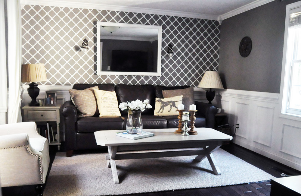
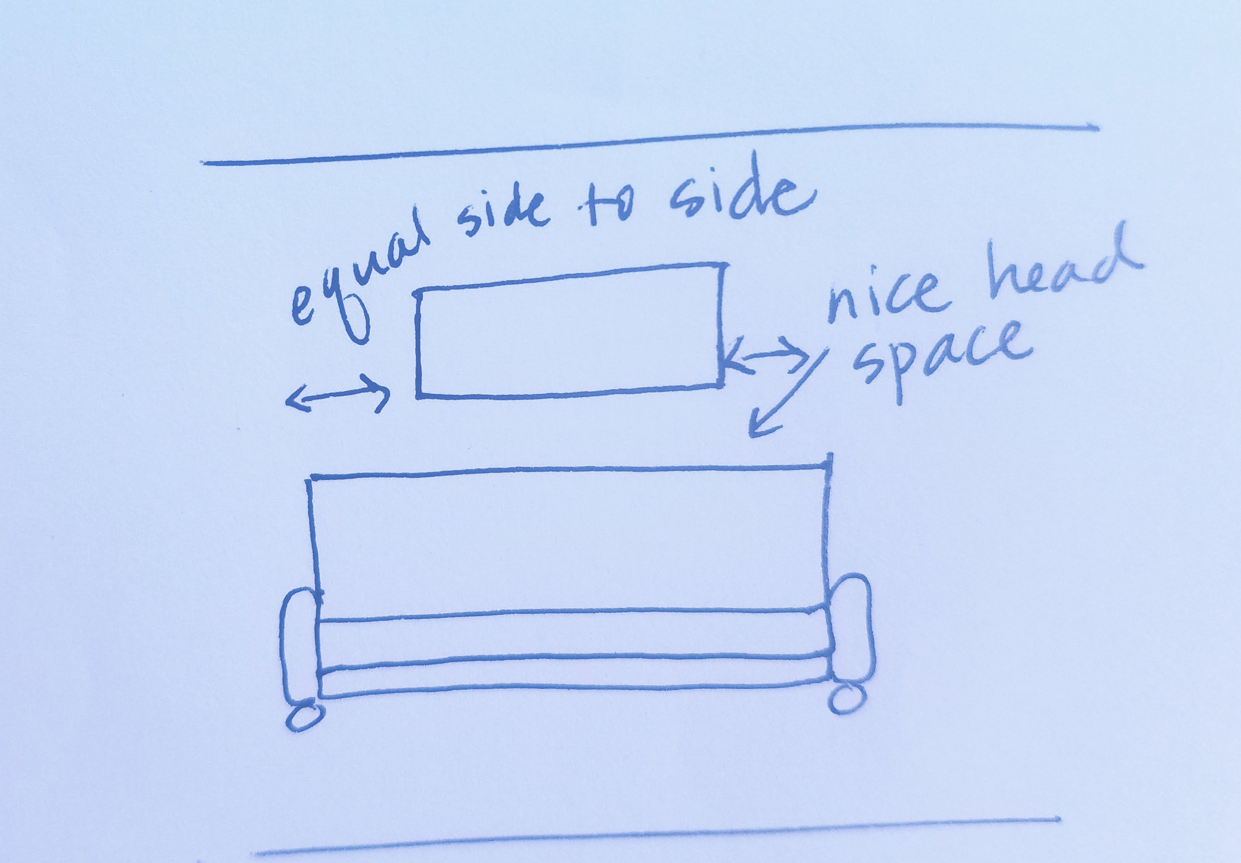
Let's also discuss hanging something over the sofa. Rule of thumb is that you won't hang something within the first 12 inches from the top of the sofa. If this rule is broken, you will find people hitting their head on whatever you decided to hang lower. Of course if your sofa is really tall, this might not be an issue, but it is always worth considering.
Okay, let's move beyond one object and discuss two. The same rules apply as far as height. If you hang them in a vertically stacked position, you want the middle of the overall length of hanging to still be eye level. If you place them horizontally, you want eye level and have equal balance of wall on either side.
When hanging two objects, you might find yourself overall conflicted with the look. This is often because we often visually gravitate toward odd numbers in decorating. Why? I am not sure, but the rule of three is often sited as a fool proof decorating strategy as many people find this visually appealing. This is not to say you cannot hang two objects together, but it often will be more appealing to you if a third is added for visual symmetry.
Let's talk about framing a focal point, such as a window or a fireplace. I have a fireplace with a large window on one side an a wall on the other. There is no place to hang something on the window side, but the window is large. Therefore, on the other side of the fireplace, I have gone with a large 3x2 framed picture. It mimics the shape of the window on the other side of the fireplace, and provides similar scale visually. When framing a focal point, you want to lessen the distraction on the sides of the item to allow focus on the center item.
How to find the middle of your wall? You want to measure the length and the height. Once you know that the wall is 8 feet high, that means it is 96 inches high. Now you would divide that in half and find that 48 inches from the floor is the middle of the height of the wall. Then you measure from side to side. Let's assume that the wall is 5 feet or 60 inches. Now we know that 30 inches into the wall is the center. Once you have found the center, you can build your placement from there. You can safely assume that visual height for many people is about 5 feet or about 60" up on the wall.
You then need to measure your object. Let's assume that the object is 2 feet tall. You would want the top of the object to hang 30" in from the side of the wall and about a foot up from the measured center point of 48" of the height of the wall. HOWEVER, you need to account for where the hanging attachment of your object is. Let's say our 2 foot tall picture, has a hang tag in the back that is 6 inches down from the top. Now, instead of hanging that object at the 60" height (visual height), we need to drop it down by 6" to account for that hanging tag in the back. So, the exact point for your nail or screw, is about 30" in from the side of the wall, and about 54" from the floor. When you hang your object, it will be smack in the center and visually the right height.
Confused yet? It's not that bad once you start measuring and it takes the guess work out of the placement. When you add additional objects, there is more math involved, but mostly you want to have symmetry on either side, and then you want some space between.
These rules get a little more lax when you start moving into a wall gallery. There is more flexibility with a wall gallery and they can be fun. The main thing to keep in mind with a wall gallery, is visual symmetry between objects. Balance and overall shape are very important. We're going to talk about that in the next post.
Have you struggled with hanging wall art? What is your best solution?
-Casey


