UNDERSTANDING PAINT SHEEN
Understanding the different sheens of paint - and where and when to use them!
Happy Spring! There is something about spring weather that inspires change. I think it is the season turning over and the new life of spring replacing the dreariness of winter. Don’t get me wrong - I love the coziness of the winter season, but there is a turning point where I am ready to move beyond the dark nights and into the fresh air and sunshine of spring.
Spring brings the energy of change…and with it comes spring fever. For me, that means cleaning house. The funny part is, once my house cleaning train begins, suddenly I am inspired to do more. I see a transformation of decluttering and a space seems new all over again. So, I start thinking about refreshing the space, which usually leads me to my most economical and high impact solution - paint. It’s kind of like the “if you give a mouse a cookie” book. If you give me an hour and a trash bag, I will eventually want to paint a room :) It’s a small disease I have; unfortunately, it’s a chronic illness!
Paint means a lot of things - you find that out the minute you step foot in a paint store. Once you have chosen your paint color, the next question is going to be about what paint sheen you will choose.
There are lot of reasons to choose certain sheens, but I wanted to provide a quick overview on what benefits each each provides, how it is most often used, and when to use each type. Hopefully that will be helpful to anyone out there that is having this question themselves.
Most often, paint can be found in the following sheens:
Flat
Eggshell
Satin
Semi-gloss
Gloss
This can get more complicated by each brand. For example, Sherwin Williams adds additional names to their sheens like Low-Lustre, Pearl, flat Enamel and Matte. Understanding the type of sheen you need will allow you to enter any paint store and ask for the sheen you want and they can provide you with their brand’s equivalent. While there are variations on each type of sheen, this should give you a basic overview. Let’s begin!
FLAT
Flat paint is your most inexpensive paint. It is the most basic of the bunch and is the most economical. For this reason, flat paint is often used in new construction. It costs less, covers easily and is easy to use. Flat paint also tends to hide imperfections and flaws in surfaces. Flat paint is often popular in older homes because walls are imperfect and the paint does not have a reflective quality that highlights flaws.
The drawbacks to flat paint is mostly durability and sheen. It is exactly what it says it is - flat. There is no luster or warmth to the paint, and there is also very little durability. In fact, you can scrub the paint right off the walls if you use water and a rag (or we found out with Mr. Clean magic erasers!). Thus, if you have a low traffic area with some imperfect walls and are on a tight budget, flat paint will likely get your job done. As for me, I almost never use flat paint. If I am going to spend the time and money painting, I am going to do something that will be more durable and warm.
The only place I do consistently use flat paint is on the ceiling. It is almost never touched and I don’t usually need the reflective quality of the paint there. There are times i have made exceptions to this, but typically, you can do flat paint there with little difficulty.
EGGSHELL
Your next step up in paint is Eggshell. Eggshell is like flat paint with a hint of sheen. Eggshell paint has about 10-25"% sheen in it, depending on the brand. The sheen adds a touch of warmth and durability, without being super glossy. It can handle a bit more scrubbing and traffic, but is still not considered a high durability paint. Because it is not super glossy, it still hides imperfections fairly well.
If your budget allows, I would make this your basic minimum paint level for most walls in your home. If you have a high traffic area, then I would upgrade to satin and here’s why….
SATIN
Satin paints are usually about 25-35% sheen. That is a great combination of durability and warmth, without being high reflective and shiny. A satin finish allows a great level of durability (think good solid scrub on the wall), and will not fade as easily. Satin finishes will show imperfections a bit more, but they offer forgiveness for marks and spots which can be removed.
If you have higher traffic areas, pets, or kids (or maybe you are just rough on your living space!), then satin paint is a great happy medium. It does cost more than its little sister Eggshell, but usually lasts longer, can be cleaned, and offers great warmth to a space.
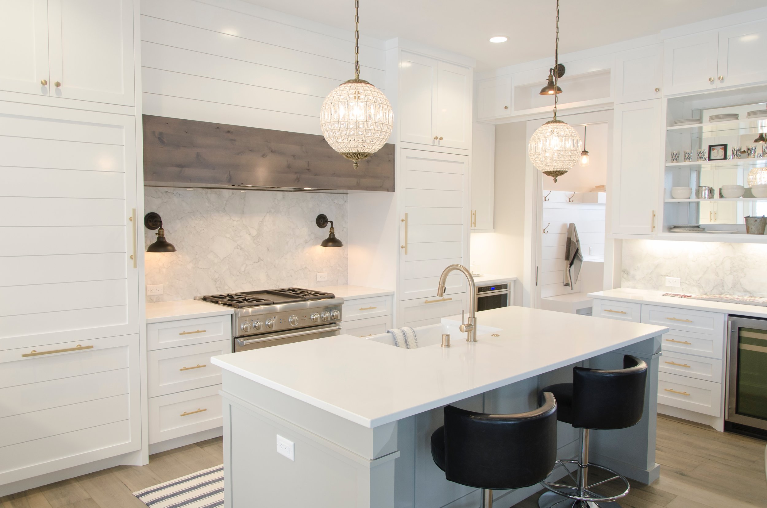
If you are painting a kitchen or a bathroom, this should be your minimum level of sheen. You can also incorporate some anti-bacterial paints into satin for these areas, that is often a good idea since these types of room seen a higher level of moisture.
SEMI-GLOSS
Anytime you see gloss in the title, we have moved into “shine” zone. Gloss paints have more gloss in them. Like in our other paints, more gloss means more durability, but also higher sheen. Now you are going to see more flaws in whatever surface is covered in semi-gloss paint because the gloss will reflect the imperfection when light hits it.
Though it does highlight imperfections, the trade-off is great durability. I like to use semi-gloss paint on cabinets, trim and baseboards because they see heavier wear.
Semi-gloss paint can come in a variety of sheen percentages - anywhere from 35-70%. The higher the sheen, the more durable and shiny the surface will be. There is a recent trend to paint semi-gloss on walls, but for me, it is too reflective.
GLOSS
Gloss paint is glossy (shocking, right?). When you open a can of gloss paint, you’ll know it. Even in the can, gloss paint is thick and shiny; it’s actually quite beautiful. Gloss paint is my favorite for a front door - bright, shiny, and thick. High gloss paint is durable and can be scrubbed and scrubbed. It is also the most expensive since you are paying for that gloss. Some people really believe in high gloss for all cabinets and trim, but I prefer a slightly more matte look. High gloss will highlight any type of surface flaw, so remember that when applying. It is also a little more difficult to paint with as it is very thick.
OTHER CONSIDERATIONS
Room Position
Natural light and also the size of the room can help you decide on your paint sheen. Rooms that are filled with natural light will tend to throw more sheen and color throughout the room. You can safely choose a lower sheen paint (like eggshell) and probably have the same level of warmth as a satin painted room. The inverse is true as well. Poorly lit rooms often benefit from a higher sheen. What little light there is in the room, can more heavily bounce off the sheen and warm up the space.
Wall Texture
Walls that are textured or imperfect will look better in a flatter sheen; it will help smooth them out. Just remember your trade off for the sheen is lack of durability.
Moisture Level
Rooms suspect to higher moisture often benefit from a higher sheen paint as it is more durable and less suspect to moisture retention. The sheen can help reflect moisture.
Room Size
Higher sheen paints allow light to bounce and help make rooms feel larger. It sounds crazy, but can really help ‘open up’ a room visually.
Same Tone, Different Sheen
One of the most popular trends right now is painting the trim and the walls the same color. This look is seamless and really can open up a room, giving a larger visual appearance. The best way to achieve this look is to paint the walls in a lower sheen paint, and then paint the trim in a higher sheen. You want a nice level of contrast here.
Depending on your taste, you might consider an eggshell wall with a semi-gloss trim. If you don’t mind spending a bit more and having a bit more light bounce in the room, then going to a satin finish wall and high gloss trim can work as well. The result is really stunning! The picture above this section with the fireplace illustrates this technique.
“All you need to paint is a few tools, a little instruction, and a vision in your mind.”
I hope that this helps you determine what type of paint sheen is best for your space. Remember to consider cost, lighting, room size, and surface texture when choosing your sheen. Again, my catch-all favorite is satin for walls and semi-gloss for trim, but you should feel free to experiment and find out what appeals to you!
Happy painting!!
-Casey
AVAILABLE SOON - GLENVILLE AVE!
Available soon - our Glenville Ave Haymount Homes
We are excited to announce that our newly renovated Glenville Ave Home is going to be available March 30th. If you have been silently stalking our Haymount Homes collection, now is the time to act (you know who you are :) We are sad to see our current clients go, but the military has its ways of changing plans on all of us! We wish them nothing but the very best!
Glenville Ave is sure to be your new favorite spot. With renovations just completed, this darling home boasts subway tile, gas cooking, hardwood floors and more. You can see even more details here. New appliances, energy efficient windows and roof, and custom designs throughout. Love shiplap? Us too - you'll get plenty of it! Featuring two bedrooms, and a full bath, full back yard, attic storage, a workshop, and additional storage building. With lawn care included, off street parking and top rated Terry Sanford Schools, you will be easily situated in convience. A quick walk to Terry Sanford High School or Fayetteville Tech. Centrally located and only 10 minutes from post. Don't pass up this rare opportunity to enjoy classic charm with fully updated style!
“Coming home is one of the most beautiful things. ”
- Casey
GLENVILLE AVE BECOMES A HOME
Our newest home is transformed!
Yippee! Our newest clients are happily settled into their new home and they are in love with Glenville; that is worth celebrating! I have to admit, it makes my heart happy to know that they are pleased with their decision to choose Glenville as their new home. I love the feeling of coming home to a place you love. These clients are amazing and did not waste a minute decorating. They were gracious enough to give me a peek when I popped in with my mom this weekend (only a week after they moved in); they had already made Glenville a beautiful home.
I had to snap some photos quick - their decorating style, which they termed “bohemian farmhouse”, is whimsical and fun; much too cute not to share. Everything seemed to fit perfectly in place. I had to snap a few photos to show off their great design. Forgive the quick photos taken with my phone - they don’t really do the space the justice it deserves :)
Enjoy this Glenville home tour! Make sure you get to the bottom of the photos to enjoy a smile - their very creative bathroom letter board sign!
Super cute, right? We continually have so much fun with our clients; they are all so creative and really enjoy dressing up their homes. Thank you to our Glenville crew for the amazing home tour and sneak peak! More renovation before and after photos coming soon!
“Coming home is one of the most beautiful things. ”
- Casey
CUSTOM WALLPAPER FOR FREE
Free DIY Custom Wallpaper wall using materials you probably already have!
YIPPEE!! I love free things (and I cannot imagine I am alone on this!) There is nothing more satisfying than getting a large bang for your buck and this project has such a great return that I just had to give you the inside scoop. I am going to give you a quick run down on a project that I did a bit back. I should have made an actual tutorial about it, but I had no idea how many people would ask me about it back then. Oh well. I think you can catch on fast, right?!
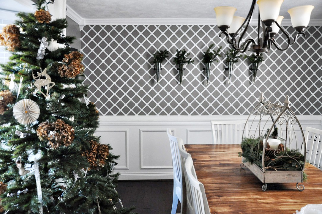
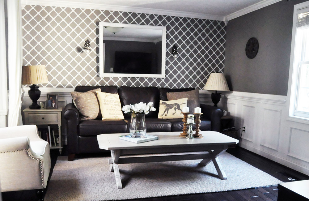
This wall in my home is painted, not wallpapered. I did not want the hassle and commitment of wallpaper when I decided to add a feature wall to this room, but I knew I wanted some level of impact beyond just paint. So, I figured I would paint my own wallpaper.
To do this, there are several sites that sell laser cut patterns and graphics, but most of them are $20-80 dollars each for the pattern and I could not find the diamond pattern I was dreaming up. Plus, I did not want to commit to the money or the shipping time and wait for the pattern (when I get an idea, I become QUITE impatient).
So while I was contemplating a lot of things (like making my own stencil...probably a bad idea), I also realized it had been awhile since I changed the air filters in our home (I know this is scattered, but this is how my brain works). As I got the filters out, I noticed a hidden gem....my pattern! Yup. I was so excited! There it was, perfectly thick, laser cut and uniform, the back side of my air filter contained just the pattern I was looking for! Even better, I was about to throw the gross part of the filter out, so I just quickly cut the back of the filter off and there was my pattern. SUCCESS!
You can buy this here from Walmart
I knew I could just tape the pattern to the wall with painter's tape, trace the pattern, reposition it again, trace again, and so on until I finished tracing the pattern on the wall. Then I would just use a little tiny paint brush to fill in the gaps with paint that I already had from doing the trim in that room. Brilliant! I figured this project would take me about four hours.
This is where the story comes to a screeching halt. Enter my husband. He asks me what my plan is, and I explain my brilliant idea. He likes the idea, and then asks me how long I think it will take (which, by the way, he always does because he has an incredible sense that can identify when I have completely lost touch with reality). I promptly reply it will take me four hours. He replies, "Four hours today? How many tomorrow?" I was shocked that he would doubt my timeline. I was certain that this project would possibly take me more than four hours.
You know where this is going. In my defense, the project did take me four hours, three times :) It was a little (LOT) more time intensive than I realized (score yet another point for my husband), but oh my, have I loved the results. A couple of points that I learned in doing this:
1. Your walls might not be fully level, so I had to fudge some areas to make sure they were good enough.
2. Plan for two coats of paint. After the first coat of paint, I realized it was going to require a second to really look right (that was a depressing moment).
3. Imperfection is part of this project. Accept it (or potentially go crazy as an alternative...although when you see the doctor and you start explaining what you are doing, you will probably get that diagnosis anyway). Most people tell me I am crazy for a lot of reasons, though, so that is nothing new for me.
In the end, the 12 hours was totally worth it. Not only did I not have to mess with trying to wallpaper old and uneven walls, but there has been no seam weakening or peeling like you can get with wallpaper over time. Plus, the project did not cost me a dime. Even if you have to buy everything new, you can pick up all the materials for less than ten bucks. Not bad for a lot of impact.
Remember, it seems a little crazy for some, but this project is super forgiving. You don't have to be perfect for it to look nice. No one is going to stick there face right up into and see if you have a little shaky hand brush stroke someplace (and If they do, then maybe they are not really your friend :) People will think it looks amazing, even if imperfect!
Perfectly imperfect
It was truly that simple. I wish I had more "how to" photos to show you, but it honestly was just taping the pattern to the wall, tracing with a pencil, and then painting it in.....plus a whole lot of patience.
Will you give it a try??
Casey
HANGING WALL ART
Taking the frustration and guesswork out of hanging objects on your walls.
Have you ever struggled with placement of objects on the wall? How high should they be? How close together? Should individual items be hung, or should they be grouped? Should you group them or hang them alone? How do you create a gallery wall? Or, my sister-in-law's exact question, "How do you hang a grouping together that won't make it look like a flea market?" Ha. We've all had that frustration of 10 nail holes in the wall, only to get one picture hung right. Even though we try to cover them with the art, we know they are there, don't we??
We've all struggled with his question and this post answers a series of questions about hanging art/objects and more on the wall. More specifically, it is a framework to help make wall decorating fun and enhance the visual appeal of your home.
Let's start simple. When you are hanging one item, whether it be a picture or an object, the most visually peaceful height to hang that object is at eye level. If you find yourself looking up or down to focus on the object, it is physically distracting rather than pleasing. Of course, eye level will vary based up on your height, but it usually varies within about 12 inches between most of us. That means that the height of the top of the object or frame, should be at the upper part of eye level and that you look about dead center onto the object.
This rule holds true even for rooms with taller ceilings and, hence, taller walls. Standard wall height is eight feet. You will still go for eye level on a 9-12 foot wall. Wall height changes, but our visual space doesn't. If you hang things higher on high walls, it will feel very uncomfortable visually.
Now, let's continue to assume you are hanging only one object. Most of the time, you'll want the object to be centered on the wall space provided. Even if the wall is only a half wall, or on the side of something else, you'll want the object in the center of the wall. This symmetry on either side will balance the visual appeal and focus the viewer on the object.
Scale. You must consider scale of your object. Let's pretend your wall is 8 feet tall and 8 feet wide. It would not look visually appropriate to have an object that was 1 foot by 1 foot large in the dead center of the wall. It would be small and not scaled appropriately for that wall. In the same vein, it would not make sense to have a 6 foot by 4 foot object on that wall. it would fill the space and be really large. Someplace in between makes sense. Think about 3-4 feet by about 2-3 feet in measurement. That would be a nice ratio on either side and really highlight your image.
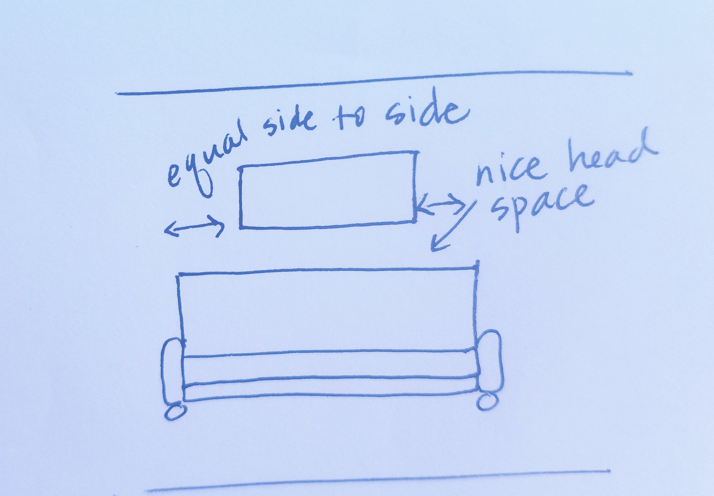
Let's also discuss hanging something over the sofa. Rule of thumb is that you won't hang something within the first 12 inches from the top of the sofa. If this rule is broken, you will find people hitting their head on whatever you decided to hang lower. Of course if your sofa is really tall, this might not be an issue, but it is always worth considering.
Okay, let's move beyond one object and discuss two. The same rules apply as far as height. If you hang them in a vertically stacked position, you want the middle of the overall length of hanging to still be eye level. If you place them horizontally, you want eye level and have equal balance of wall on either side.
When hanging two objects, you might find yourself overall conflicted with the look. This is often because we often visually gravitate toward odd numbers in decorating. Why? I am not sure, but the rule of three is often sited as a fool proof decorating strategy as many people find this visually appealing. This is not to say you cannot hang two objects together, but it often will be more appealing to you if a third is added for visual symmetry.
Let's talk about framing a focal point, such as a window or a fireplace. I have a fireplace with a large window on one side an a wall on the other. There is no place to hang something on the window side, but the window is large. Therefore, on the other side of the fireplace, I have gone with a large 3x2 framed picture. It mimics the shape of the window on the other side of the fireplace, and provides similar scale visually. When framing a focal point, you want to lessen the distraction on the sides of the item to allow focus on the center item.
How to find the middle of your wall? You want to measure the length and the height. Once you know that the wall is 8 feet high, that means it is 96 inches high. Now you would divide that in half and find that 48 inches from the floor is the middle of the height of the wall. Then you measure from side to side. Let's assume that the wall is 5 feet or 60 inches. Now we know that 30 inches into the wall is the center. Once you have found the center, you can build your placement from there. You can safely assume that visual height for many people is about 5 feet or about 60" up on the wall.
You then need to measure your object. Let's assume that the object is 2 feet tall. You would want the top of the object to hang 30" in from the side of the wall and about a foot up from the measured center point of 48" of the height of the wall. HOWEVER, you need to account for where the hanging attachment of your object is. Let's say our 2 foot tall picture, has a hang tag in the back that is 6 inches down from the top. Now, instead of hanging that object at the 60" height (visual height), we need to drop it down by 6" to account for that hanging tag in the back. So, the exact point for your nail or screw, is about 30" in from the side of the wall, and about 54" from the floor. When you hang your object, it will be smack in the center and visually the right height.
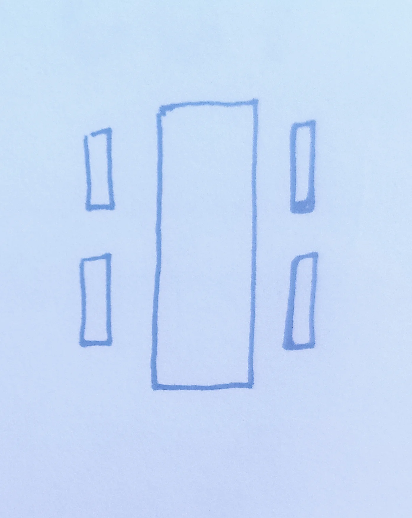
Confused yet? It's not that bad once you start measuring and it takes the guess work out of the placement. When you add additional objects, there is more math involved, but mostly you want to have symmetry on either side, and then you want some space between.
These rules get a little more lax when you start moving into a wall gallery. There is more flexibility with a wall gallery and they can be fun. The main thing to keep in mind with a wall gallery, is visual symmetry between objects. Balance and overall shape are very important. We're going to talk about that in the next post.
Have you struggled with hanging wall art? What is your best solution?
-Casey
Choosing Paint Colors - Part One - Evaluating the Undertone
How to evaluate an undertone to be sure you'll like the color on the wall.
Why is choosing paint colors so difficult?
This is a question that seems to frustrate many clients, homeowners, and decorators. Just when you think you have it figured out, it goes up on the wall, and SURPRISE, it is nothing like you envisioned. Back to the drawing board.
I am with you. I have struggled with paint colors for many years. After thinking I had a fool proof plan or color, I would be excited to put it in a new room, only to see the color behave differently. There had to be a better way to evaluate my color before putting it up on the wall.
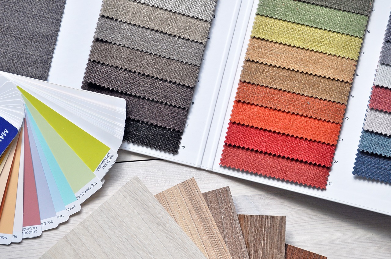
I found the common theme of my mistakes was that I had misjudged the undertone of the color. Most paints are rooted in a yellow, blue, green, or red undertone. When you start to compare the swatch colors, you can see how a certain shade pulls through. Understanding that you like or dislike certain undertones is critical in deciding what colors will work for you.
Let's take an example. In the photo above, there are several shades of neutral and brown present. In the bark, we have a brown that has a green and blue undertone, and it presents as more of a gray as a result. The background behind the cat has a more yellow undertone, and it presents as a warmer brown. Looking at the back of the cat, and somewhat in the face, you will see a brown that has a more red undertone, giving the brown even more warmth and a reddish undertone. Finally, the cat's fur has a very mild gold undertone, making a very light beige slightly warm brown. As you can see, there are several browns, all of which present as brown, but when you look at each more closely, they have different undertones which come across while altering the shade.
When you have your paint chip samples, you can look at three colors that you are considering, and you can see what undertone appeals to you. Blue undertones will cast cooler vibes to a color, whereas yellow and red undertones will warm things up. Red undertones tend to cast more "santa fe" pink/rustic red cast into their color, and that is something that does not typically appeal to me. However, in my bathroom, because of the lighting (which is another topic we'll discuss), I had to choose a gray that had a red undertone because the marble tile we chose had the slightest bit of red undertone in it. I had missed that at first and had chosen a cool gray (blue undertone - Gray Owl by Benjamin Moore), and it ended up looking Mint Green on the wall! Not at all what I was going for. I was afraid to choose the red undertone gray as I don't usually like those, but it was the perfect choice in that bathroom. Sometimes you have to go with what you see, rather than what you think you want.
In summary, when comparing colors, you have to decide what undertones appeal to you. This is the first step to ensuring you are going to like the color once it gets on the wall. As an experiment, look at the things you already have in that room or in your home. Evaluate the undertones and see what you are already drawn to based upon what is in your home. Additionally, you also ensure that the new color you choose will harmonize with what you already have in the room (it is expensive to have to purchase new furniture and décor just because you repainted!). There is no wrong or right, only what you prefer, and this should start coming through when you evaluate what you already have. If you are struggling, I like to take crayons in the color of red, yellow, green and blue and then put it up against whatever item I am evaluating. Usually, the crayon with the same undertone as the color of the item being evaluated will look the best with that item. That is a little trick to help determine the undertone.
Of course, in my example above, even if you don't think you like a certain undertone, you might find that you have chosen other things with that same undertone. If you try to compete with several undertones in the same space, you'll end up with a mess on your hands. Trying to keep the undertones complimentary throughout the space will unify the space. This is a subtle point, but it is what will make the room pop at the end. People won't be able to place their finger on "why" the room just feels good, but they feel like it is visually appealing. That is likely because the undertones are congruent.
More on color choice will follow, including lighting, paint sheen, choice for neutrals and home rentals, and more. Stay tuned!
Casey


